Case study
Navigation simplified
Role
Lead designer
Timeframe
2025–2026
Company
The Challenge
Navigation wasn’t just a visual redesign. It required rethinking how millions of people moved through Pinterest.
Three challenges shaped the work
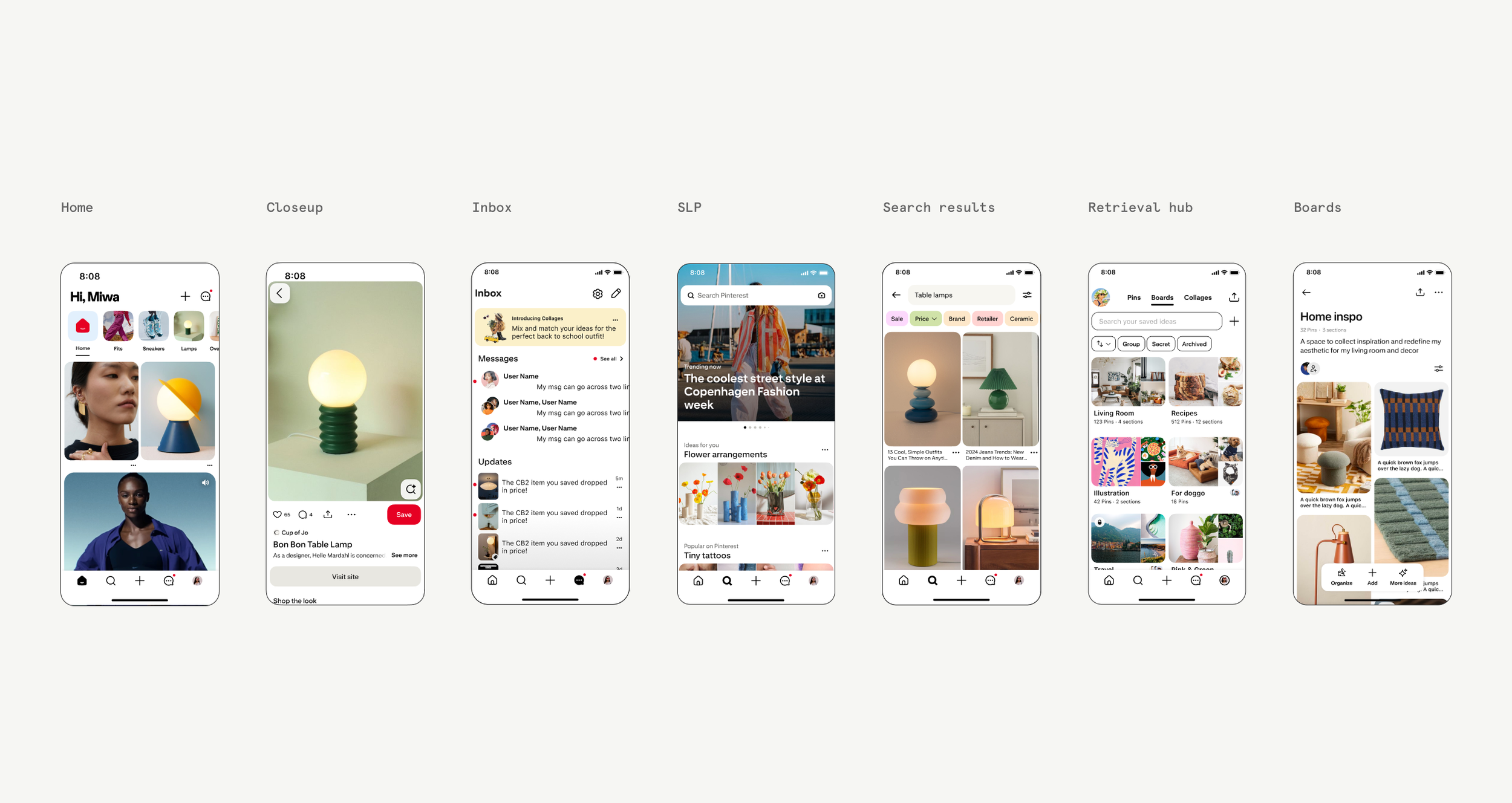
An unfocused information architecture
Years of incremental growth left the global navigation cluttered, with high-value actions like Search and Curation competing alongside secondary destinations.One system, many surfaces
Home, Search, Boards, Closeup, and Profile each had unique needs, requiring a navigation framework that felt consistent while adapting to different contexts.Organization-wide alignment
Because navigation touched nearly every surface, success depended as much on cross-functional alignment as it did on design.
Strategy
Rather than approaching this as a UI refresh, we began by redefining what navigation should optimize for.
Three principles guided every decision
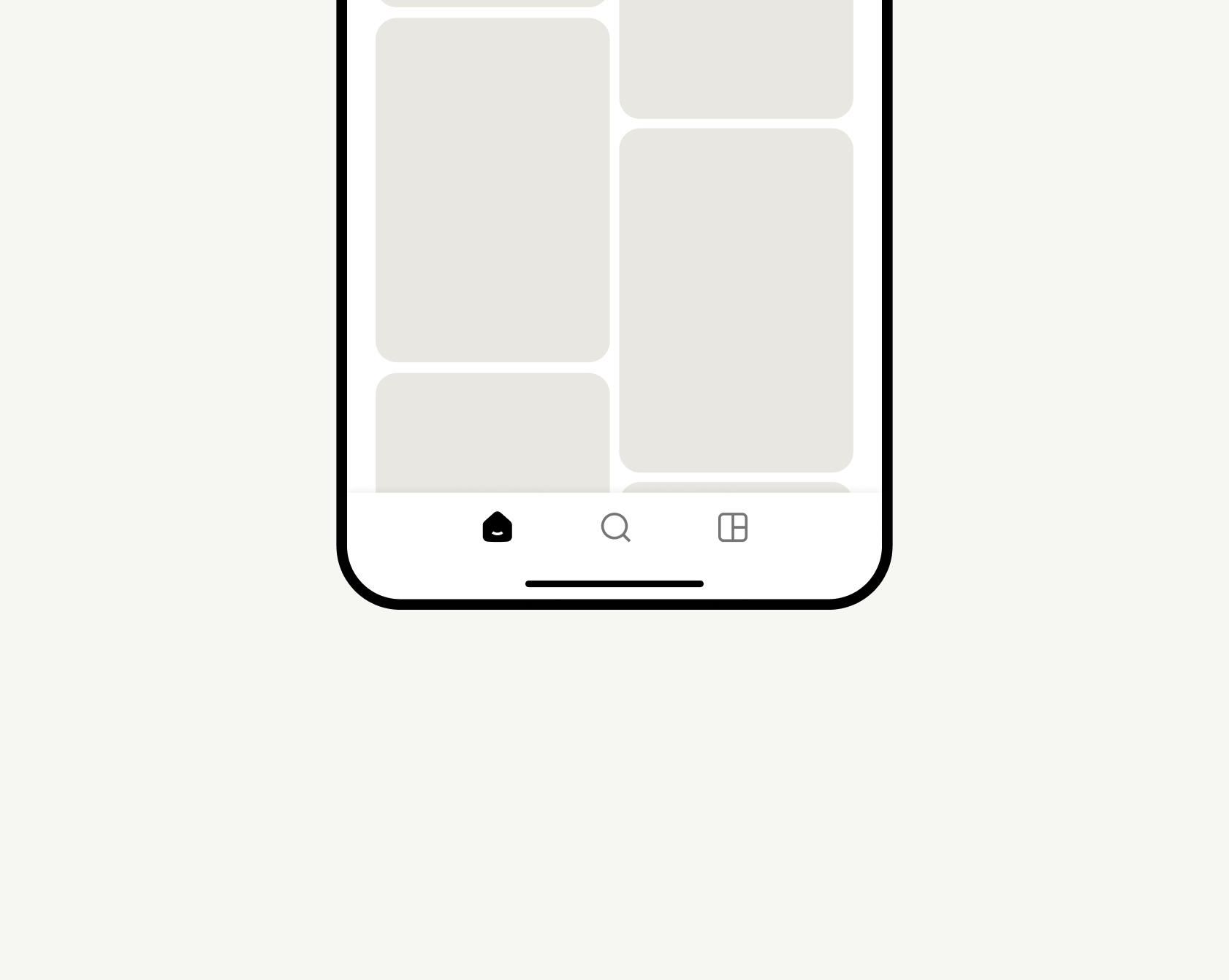
Prioritize Pinterest’s core behaviors
Focus navigation around Pinterest’s highest-value actions: Discover, Search, and Curate, while keeping secondary actions accessible but de-emphasized.
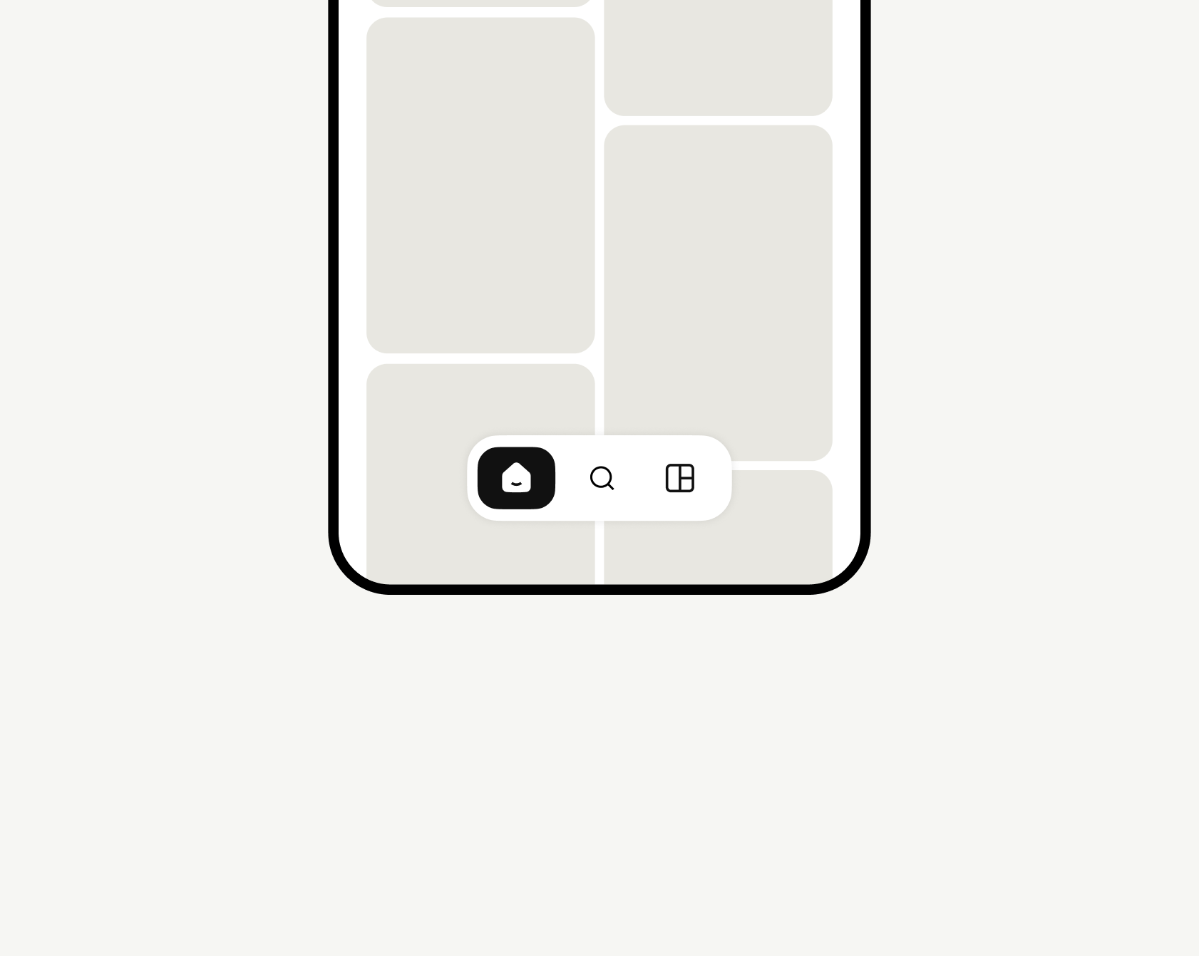
Let content become the hero
Reduce the visual weight of navigation to reclaim above-the-fold space for inspiration and ads.
Reinforce personalization
Help users immediately understand that Home is personalized and different every time they return.
Explorations
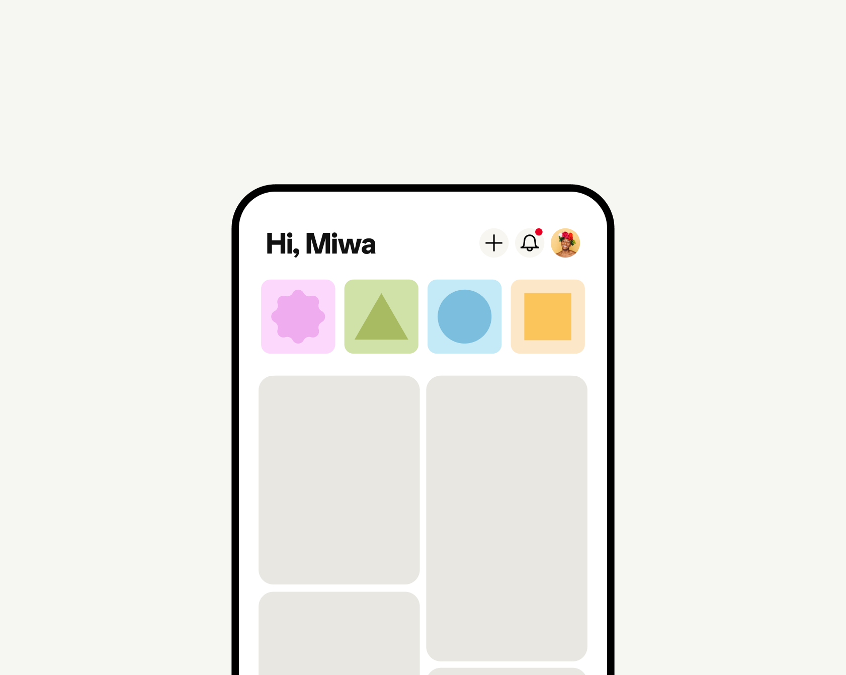
Designing navigation meant redesigning much more than the navigation bar.
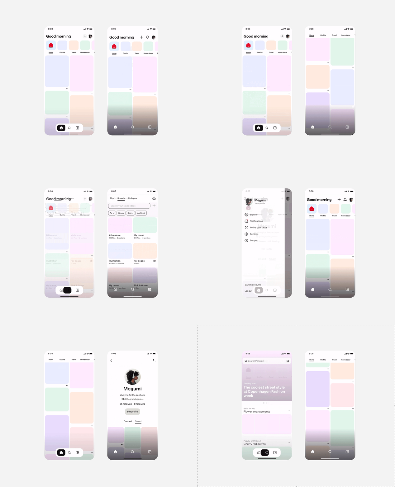
Moving Create and Notifications out of the primary navigation required rethinking the top of Home, while a parallel Search initiative required a more flexible navigation framework. We explored dozens of concepts across information architecture, interaction patterns, and visual design before converging on a solution that served both efforts.
Research & Validation
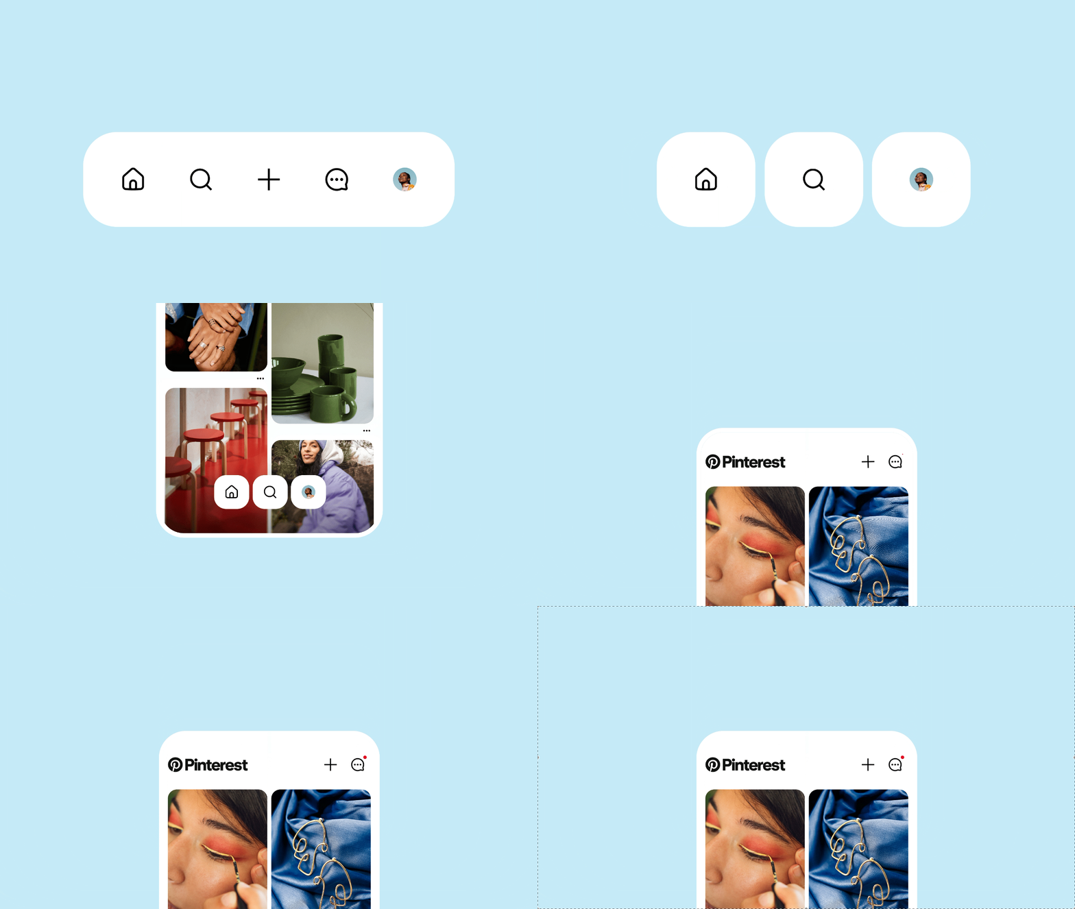
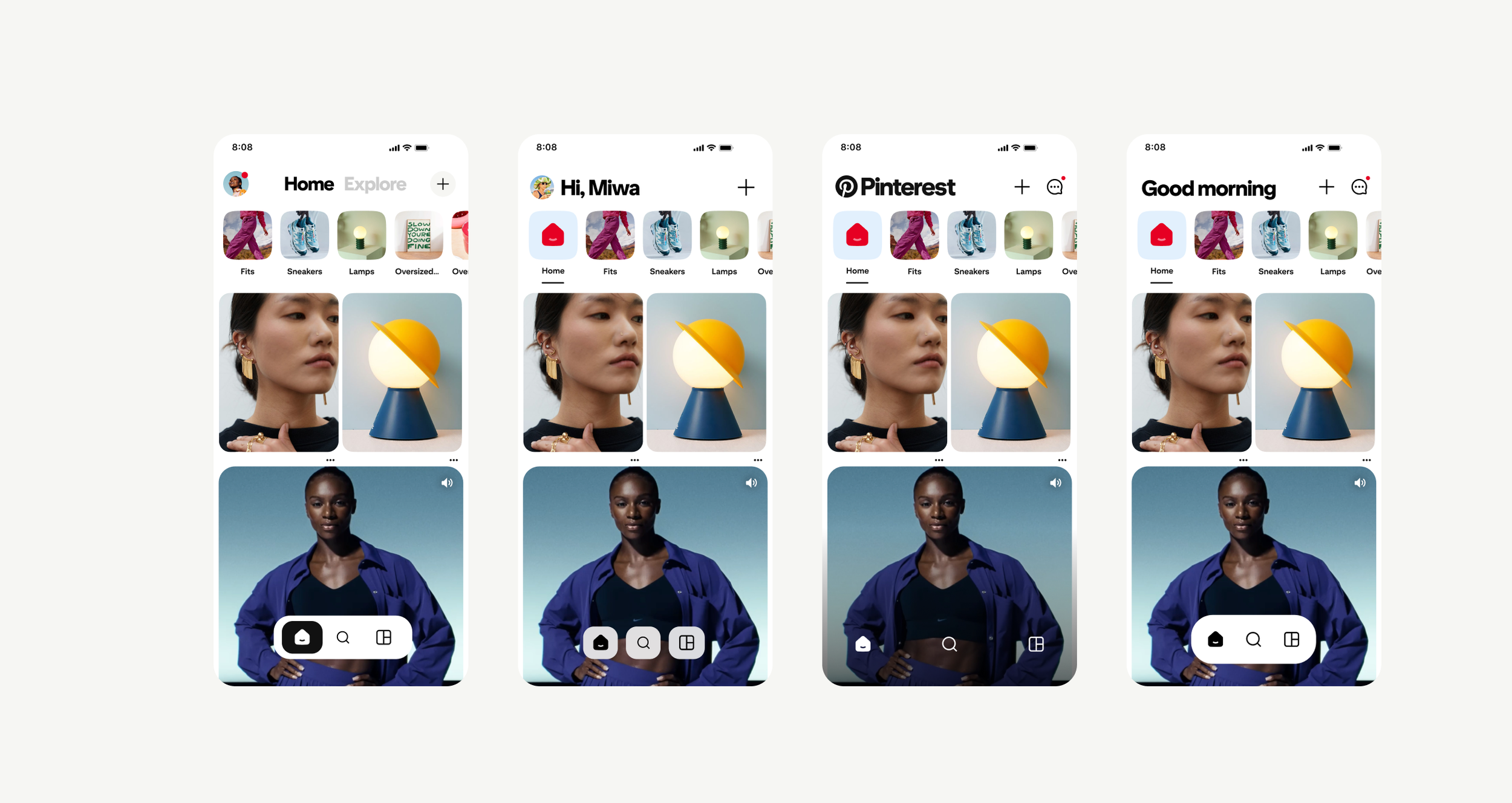
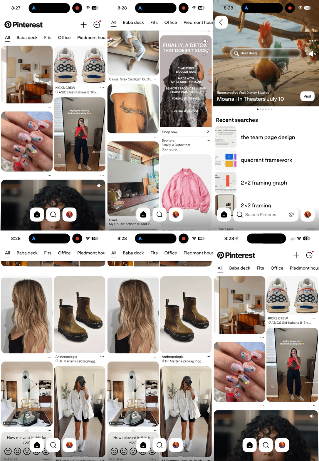
We partnered with User Research to validate our principles through moderated usability studies. Together, we evaluated simplified navigation concepts, floating versus overlay navigation, alternative placements for Inbox and Retrieval, and multiple Home greeting concepts.
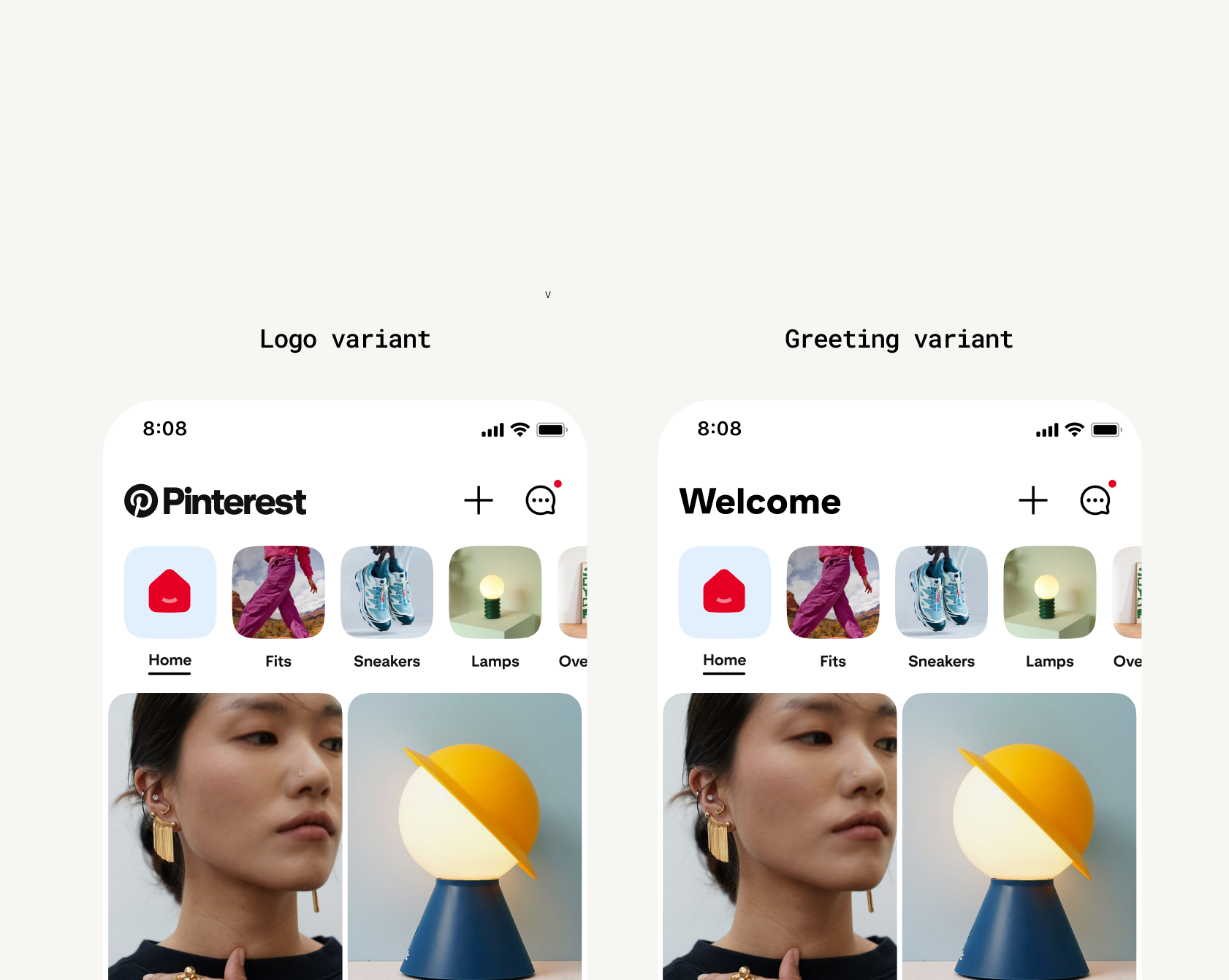
In parallel, we ran lightweight product experiments before investing in a broader redesign. By intentionally limiting visual changes, we isolated the impact of the information architecture itself.
We tested
A dynamic Home greeting alongside a Pinterest wordmark variant.
We also introduced another variant with the logo to understand how something more generic would test.
Key Learnings
Research revealed two clear insights.
Simplicity wins.
Users consistently preferred a focused navigation centered on Home, Search, and Boards.
Personalization is powerful—but fragile.
A thoughtful greeting reinforced that Home was fresh and personalized, but generic or inauthentic messaging reduced trust. This ultimately led us to favor the Pinterest wordmark over personalized greetings.
Our experiments validated the broader direction.
Simplifying navigation increased successful sessions and strengthened Search and Related Pin engagement, particularly among infrequent users. As expected, de-emphasizing secondary actions reduced creation and News Hub engagement—a tradeoff we accepted in service of a simpler navigation model.
Final Solution
The final system created a scalable navigation framework centered on Pinterest’s highest-value experiences.
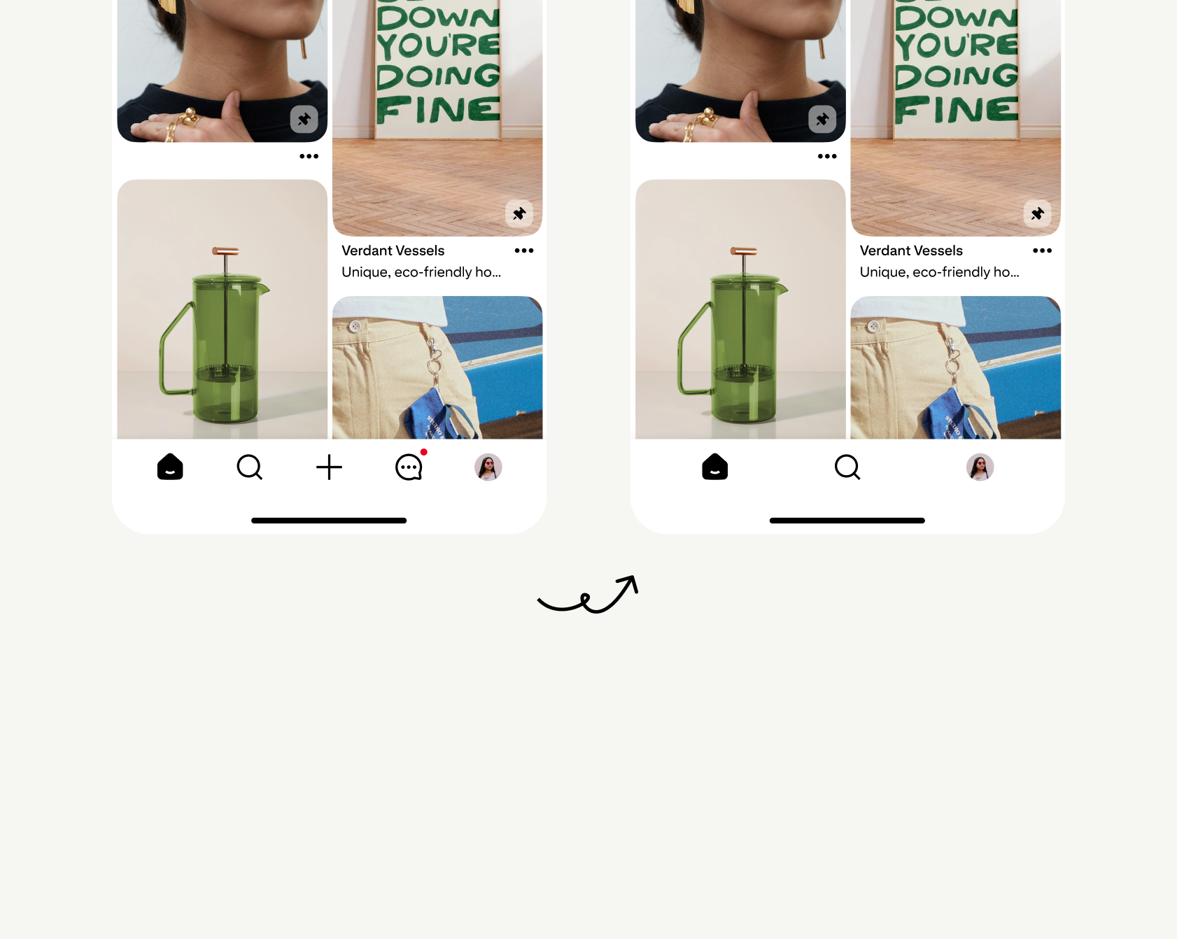
Focused the primary navigation on Home, Search, and Boards
Relocated Create, Notifications, and Messaging into secondary entry points
Introduced a floating navigation treatment to increase above-the-fold content visibility
Established consistent navigation principles that could scale across every major Pinterest surface
Results & reflection
The redesign improved engagement across several of Pinterest’s core metrics and is in production today:
Successful sessions: +0.233%
Search engagement: Increased
Related Pin engagement: Increased
High-quality ad clicks: Increased
Accidental ad clicks: Decreased
Not every metric improved. As expected, moving secondary destinations out of the primary navigation reduced engagement with:
Native creation
Board revisitation
News Hub engagement
These were intentional trade-offs in support of a simpler navigation model that prioritized Pinterest’s core value propositions: discovering and saving inspiration.
Unlike designing a single feature, navigation influences every interaction a user has with a product. Success depended less on producing the “best” interface and more on balancing competing product goals, aligning dozens of stakeholders, and creating principles that could scale across an evolving ecosystem.